
Features
Oct 4 2023 at 12:00 AM
Overview
In this section, the user will explore the capabilities and functionalities of the Digital Overlay widget. It will provide detailed insights into the Digital Overlay widget’s features, and customisation options. Additionally, there is a step-by-step guide on how to navigate through the widget’s interface, ensuring the user can harness its capabilities effectively and efficiently.
Navigation Bar
Once the widget is selected, the navigation bar on the left-hand side of the view will provide the user with more settings specific to the widget’s configuration, as highlighted in Figure 1. Below is a list of the links and settings that will be available on the Navigation Bar when configuring the Digital Overlay widget:
- Widget toolbox: Opens a window containing widget icons and buttons that serve as tools in the Radar Design Studio.
- Layers: Displays the entire Radar Design view, including all the widgets being designed on that view. This allows users to easily select a specific layer and view the properties of that layer.
- Link view panel: Links a preconfigured View panel to the view.
- View instances: Configures the Digital twin instances that establish the context for the widgets. At least one widget must link to a Digital twin endpoint. The instance can be selected in preview mode or in Radar.
- Settings: This opens the Settings window where the user can configure and view related settings.
- Paste: A feature used to paste a widget.
- Copy: A feature used to copy a widget.
- Open config editor: Opens the Config editor window.
- Delete widget: A feature used to delete a widget.
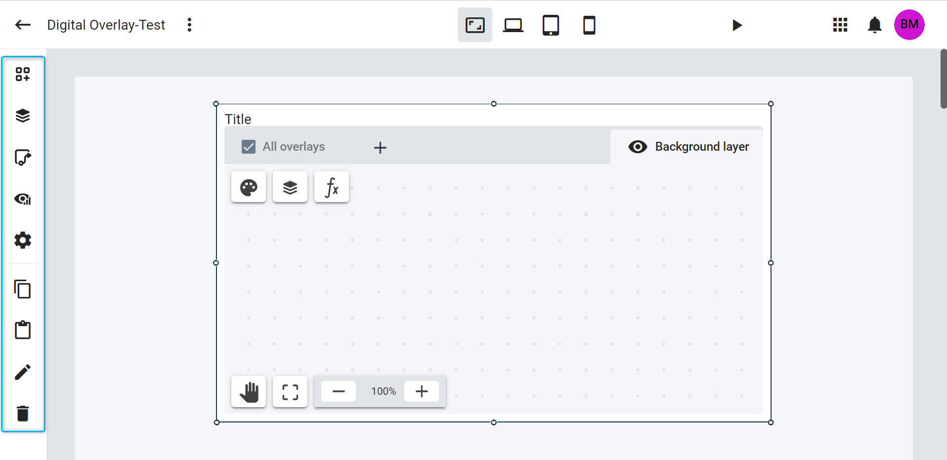
Figure 1 - Navigation Bar
 |
The Copy, Open config editor, and Delete widget buttons will only be displayed when the user clicks on the Digital Overlay widget. |
Widget Quick Links
The Digital Overlay widget features quick links that enable the user to configure it.
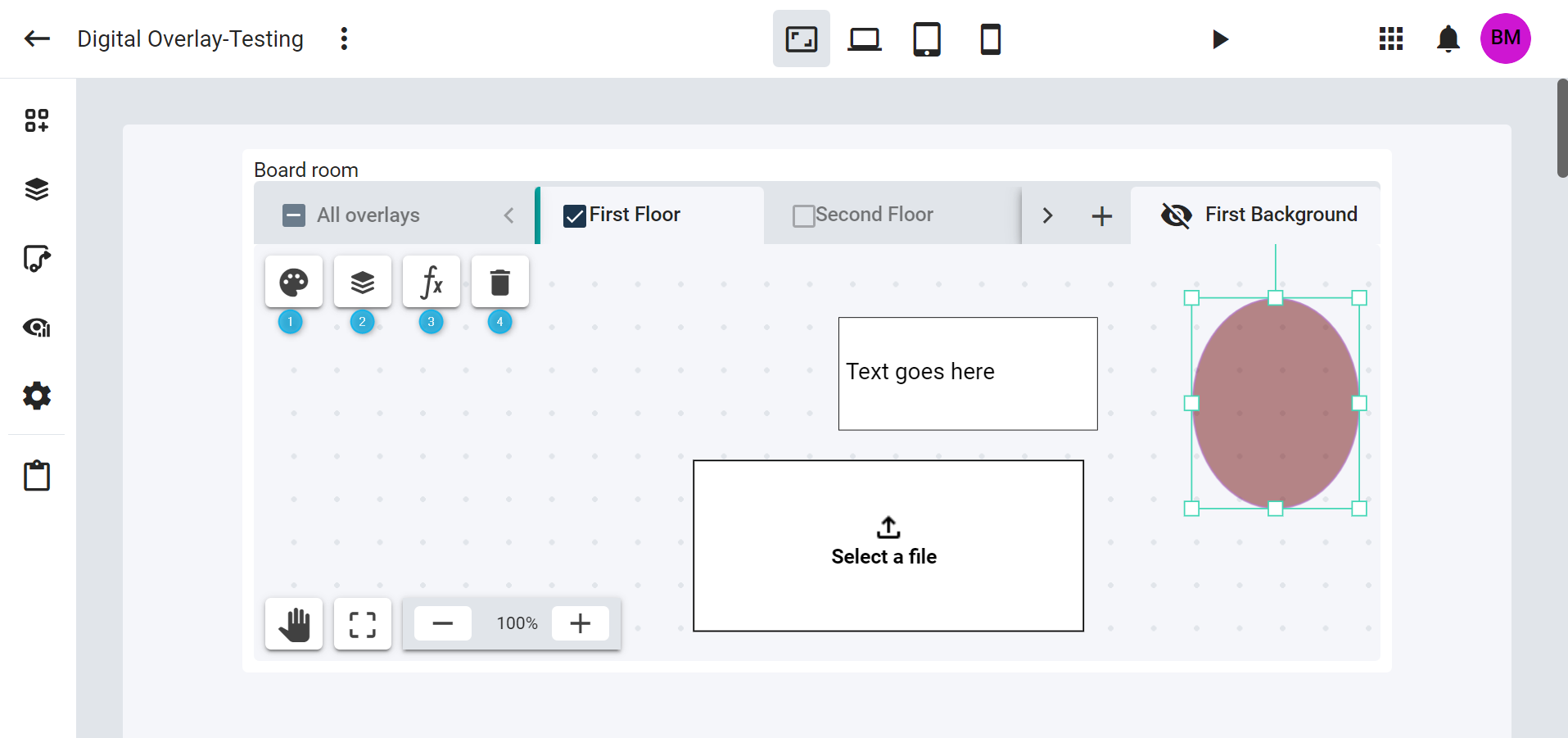
Figure 2 - Widget Quick Links
At the top left of the widget (Refer to Figure 2), you will find the following links:
- Open Options: Opens the Options tab in the Config editor window.
Toggle layer list: Here, the user can see the layout of their layers and the content of each layer. It provides a focused view of a specific widget. Users can enable or disable the visibility of each element. Refer to Clip 1.
Clip 1: Toggle Layers List
- Open Conditional Formatting: Opens the Conditional Formatting tab in the Config editor window.
- Remove element: Appears at the top left corner of the widget when the user selects an element in the layer. It allows the user to delete a selected element.
At the bottom left of the widget (Refer to Figure 3), you will find these links:
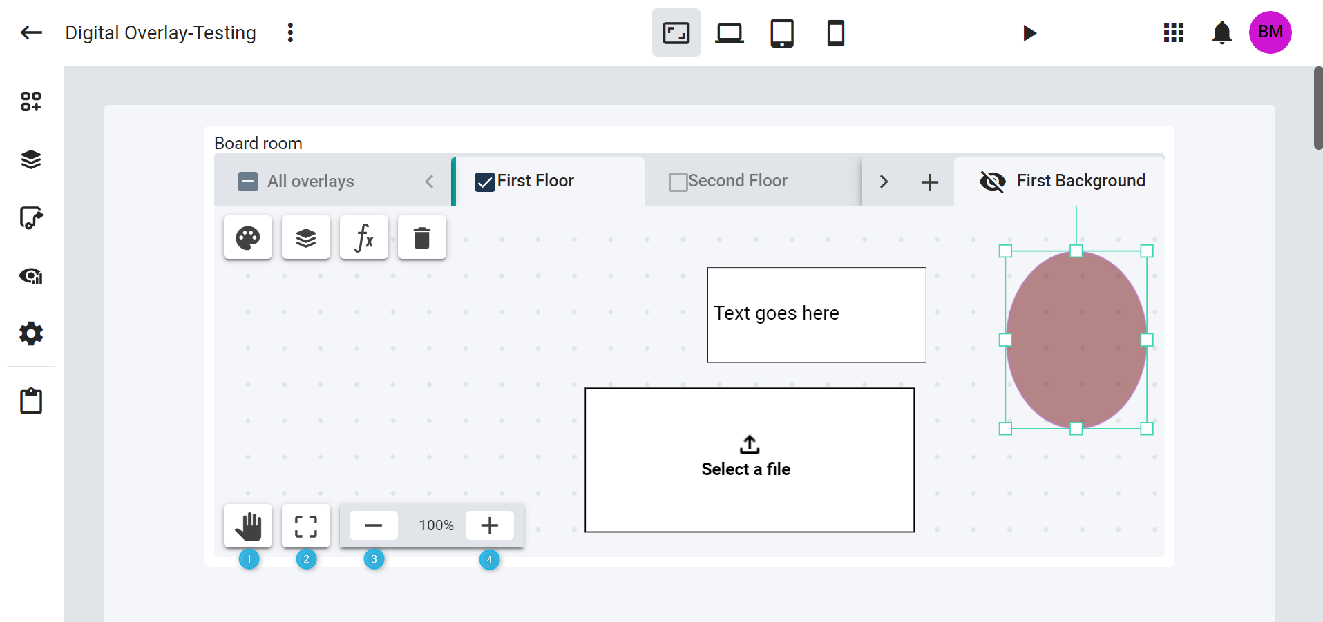
Figure 3 - Widget Quick Links
- Toggle panning: Use this to move multiple elements around on a layer. Click on the icon to enable panning, move the elements, and then click the
Toggle panningbutton again to stop the function. - Reset zoom: Resets the element view to 100% after either zooming in or out.
- Zoom out: Reduces the display size.
- Zoom in: Increases the display size.
Layers
The Digital Overlay widget offers the option to add overlay layers. It is possible to configure the widget with multiple overlay layers, each of which can contain various shapes, media, and value boxes. The background layer is initially displayed when the widget opens, and a user can configure it with an image.
Important to Note:
- A maximum of 5 overlay layers can be added on the widget.
- To change the name of an overlay layer or the Background layer, double-click on its tab.
- A layer’s name must be at least 3 characters long.
- A layer’s name cannot exceed 30 characters in length.
- Layer names must be unique.
Overlay layer
Here is a step-by-step guide on how to add an overlay layer to the widget:
- Inside the Digital Overlay widget, users can add their relevant layers by selecting the
+icon at the top of the widget. This action will open the ‘Layer’ screen. Refer to Clip 2. - Input the desired Layer Name in the space provided.
- Select
OKto save the name and exit the screen. A confirmation message indicating that the layer has been added to the widget will be displayed at the bottom of the screen. Alternatively, theCancelbutton can be used to close the screen without saving any information.
Clip 2: Adding Layers
Background layer
When the Digital Overlay widget opens for the first time, it includes the Background layer tab. Users can rename this background layer by following these steps:
- Double-click on the ‘Background layer’ tab. A message will prompt the user to enter a new layer name.
- Select
OKto save the name and exit the screen. An indication that the action is being saved will be highlighted at the top right of the widget (Saving…). TheCancelbutton can be used on the same screen to close it without saving any information.
Clip 3: Renaming the Background Layer
Deleting an overlay layer
To delete an overlay layer, follow these steps:
- Select the widget that contains the overlay layer you want to delete.
- Hover the cursor over the layer tab, and an
xicon will appear on the right side of the tab. This icon is used to delete the layer. - Click on the
xicon, and a confirmation message will appear in the window. Refer to Clip 4.
Clip 4: Deleting Layers
Elements
During design time the user can add, move, and scale/resize various elements placed on the layer. These elements include shapes, value boxes, and images. Here is a detailed explanation of each element category:
Shapes
All shapes can be found under Options tab in the Config editor. They include the:
- Circle
- Rounded rectangle
- Triangle
- Star
- Polygon
- Line
- Arrow
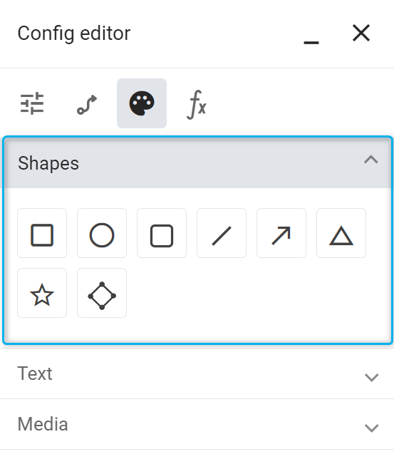
Figure 4 - Shapes
The listed shapes:
- Support endpoint linking.
- Can be included in a conditional formatting rule.
- Can be moved and resized.
 |
| The star shape can only be resized by the corner resize handles, and the aspect ratio option is locked in its Config editor, ‘Position’ menu. |
Text
The following value boxes are available in the ‘Text’ menu, under Options tab in the Config editor.
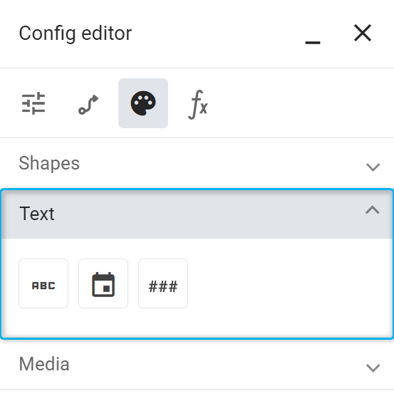
Figure 5 - Text
- Text
- Date
- Number
 |
| The Date and Number value boxes are shorthand versions of the Text value box that will populate the formatting according to a date or a numeric value. |
Media
The following image element is available in the ‘Image’ menu, under Options tab in the Config editor.
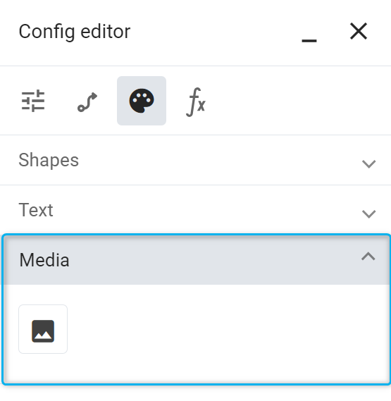
Figure 6 - Media
 |
| A user can rotate an element by clicking on the top square, and if an element does not have this top square, it means it cannot be rotated. If it does not have the squares around the element, it means the user cannot resize it; they can only resize the aspect ratio of that element, including the width and height at the same time. Refer to Figure 7. |
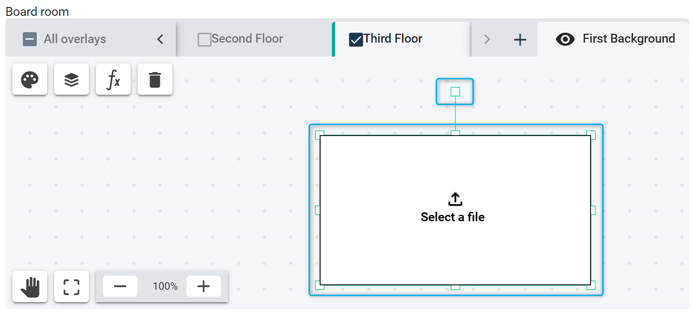
Figure 7 - Rotating and expanding an element
Adding elements to an overlay layer and a background layer
Users can place the following types of elements on each layer:
- Image
- Value Box
- Shape
 |
| The Background layer is configured and only accepts image elements. |
Two ways to add shapes, text, or media elements:
- Click on the elements once, and then click on the layer.
- Click on the element in the ‘Config editor’, and then click on the layer while keeping the left mouse
buttonpressed. Draw the element to the appropriate size and then release. It will create the shape, text, and the image element on the layer.
Clip 5: Adding elements to a layer
Deleting elements from overlay layer and a background layer
To delete an element on the overlay layer:
- Select the overlay layer and the element you intend to delete. A
Remove elementicon will appear on the top left of the widget, allowing the user to delete the selected element. - Click the
Remove elementicon to delete the element. An indication that the action is being saved will be highlighted at the top right of the widget (Saving…).
Clip 6: Deleting elements from a layer
View panel and widget
The Digital Overlay widget comprises a View panel and a Widget. These are the initial components that users encounter when they drag and drop the Digital Overlay widget from the Widget toolbar. Within this widget, users can add layers and elements and customise them according to their preferences. The following sections provide a guide on how to delete a View panel and a Widget.
Deleting a View panel
To delete a View panel, follow the steps outlined in the video below:
- Select the ‘View panel’ you wish to delete.
- Navigate to the
Delete view panelbutton located in the Navigation Bar. Clicking thisbuttonwill open an ‘Unlink View Panel’ screen, providing the user with the option to either remove the View panel and its associated tiles from the view, or to decline this action. - Choose the
Yesbutton to confirm the deletion or select ‘No’ to decline.
Clip 7: Delete View Panel
Deleting a widget
To delete a widget, follow the steps outlined in the video below:
- Select the widget you wish to delete.
- Select the
Delete widgetbutton located at the bottom of the Navigation Bar. Clicking this button will open a ‘Delete widget’ screen, which will confirm whether you are certain you want to delete the widget. - Choose the
Yesbutton to confirm the deletion or selectNoto decline.
Clip 8: Delete a widget