
Design Studio
Jan 1 2023 at 12:00 AM
Design Studio is an application that will allow authorised users to design custom dashboards which can be used with Radar. Unlike the Dashboard application, Design Studio is a separate application from the standard Radar application. The separation ensures that only properties needed to display widgets are loaded at runtime which ensures that Radar views load as quickly as possible as there is no need to include the design time properties and values.
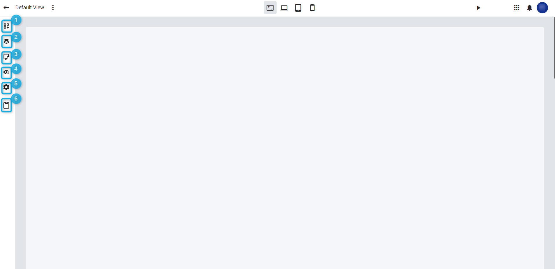
Figure 1 - Design Studio
From the left toolbar the user has access to the following panels:
- Widgets toolbox
- Layers
- Link view panels
- View instances
- Settings
- Paste
Widgets toolbox
From the Widgets panel the user can drag and drop widgets onto a Radar View or Radar View Panel. A Radar View Panel will automatically be created if a widget is dropped directly onto a Radar View.
Layers panel
The Layers panel allows the user to select a specific panel. Radar views are split into separate layers, the top layer representing Radar View Panels. Each view panel consist of multiple widgets with each widget represented on a separate layer. The widgets are split into separate layers that groups the widget's properties into logical groups. This allows users to easily select a specific layer and view the properties of that layer. When a layer is selected the corresponding layer will be selected in the designed as well, allowing users to quickly select a specific layer to edit.
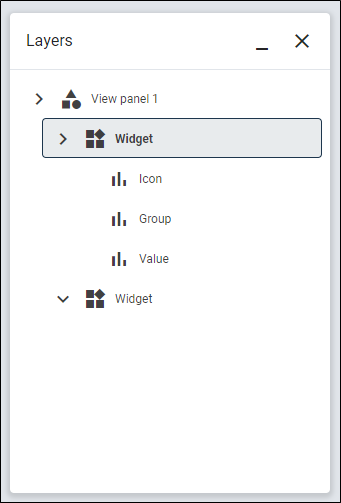
Figure 2 - Layer selection
Link view panels
View panels can be added to Radar views by selecting the View panel Icon on the toolbar. The 'Select view panel' panel will appear where the user can select the specific view panel and drag and drop the panel onto the Radar View. Radar View Panels that were designed separately (as standalone entities) will not be editable on the Radar View.
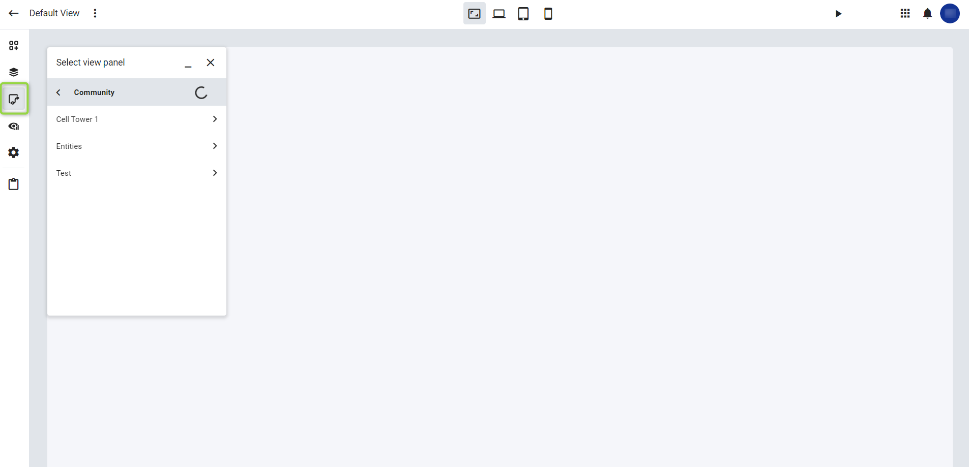
Figure 3 - Link view panel
Settings (alarms)
The primary function of the Settings tab is to manage alarms. Here you can enable or disable alarms, filter, group and manage notifications. When enabled, an Alarm panel will be available to display alarm events.
Filtering & Grouping
- Priority: Select which alarm priority levels to display
- State: Toggle the alarm state on or off
- Alarm type: Select the alarm type from the list or enter text manually
- Entities: Select an entity from the list
- Grouping: From the dropdown list, select how alarm entities should be grouped. You can choose between Ungrouped, Active, AlarmType, and Priority.
General
- Alarm refresh delay: This property can only be applied if you are filtering by an entity or digital twin property. You can select a value and measurement unit
- Bulk acknowledgement: Selecting this checkbox allows you to acknowledge multiple alarms at once
- Alarms panel default: Select if the alarm panel should be docked, or floating inside the window
- Notifications: This property can only be applied if you are filtering by an entity or digital twin property. You can select to play a sound for notifications and display a Toast notification banner.
Clip 1: Configuring your alarms
You can view your docked or floating alarm panel by clicking on the Start preview button
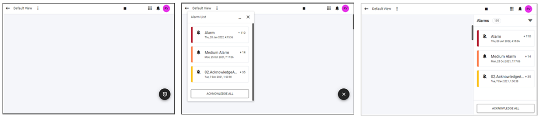
Figure 4 - Alarm panels. Floating panel: Closed panel before click (Left), and floating panel after you click the button (center). Docked alarm panel (right)
View selection
The view selection can be used to navigate to another Radar View / Radar View Panel.
Device selection
The device selection screen can be used to change the size of the design area, representing the size of a computer, tablet, and mobile screen. By default, the computer screen sized with be used, and the layout of the dashboard will be adjusted if smaller screen sizes are selected. The designer can view the generated layout on the smaller screens by using the Device selection. If the designer can override the generated layout on the smaller screen by reordering the widgets, the layout will then be saved and used for the specific screen size.
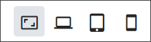
Figure 5 - Device selection
Preview
The preview button can be used to load a preview of the Radar View / Radar View Panel that are currently being designed. Values for endpoints will be loaded to indicate how the end-user will see the view / panel.