
Widget Toolbox
Feb 1 2023 at 12:00 AM
Overview
The Widget Toolbox is a feature on Design Studio where the user can drag and drop widgets onto a Radar View or Radar View Panel. A Radar View Panel will automatically be created if a widget is dropped directly onto a Radar View. There are various widgets available to create your Radar View.
Properties
The following properties are common for most of the widgets, and are described below:
1. Title
The Title section is available on most widgets, with the identical properties across all the widgets that support a Title.
Clip 1: Title properties
Value: The Title's text is to be displayed on the widget.
Type: The type of the title which determines the default value for the size of the text.
- Heading: Size is set to 16.
- Sub-heading: Size is set to 14.
- Body: Size is set to 12.
- Custom: User can specify the size of the tile.
Size: Specify the size of the title, if the default size is changed the Type property value will change to Custom.
Format: Can change the format of the title to Superscript or Subscript.
Align: Align the title left, centre or to the right of the widget.
V-Align : Vertical alignment of the tile, options available are top, middle, bottom.
2. Config editor
In order to access the Config editor panel, the user will need to double click on the widget which then allows for editing the selected layer's properties. The content of the Config editor will depend on the type of layer selected. If a widget is selected all the widgets properties will be displayed. If a specific widget property group is selected, then only the subset of properties will be visible in the Config editor.
Clip 2: Config editor
3. On-click
Widgets can be configured to open specific Radar views when the user clicks on the widget. If a Radar view is linked to a widget the On-click icon will appear in the top right corner of the widget. The On-click functionality is available on most widgets.
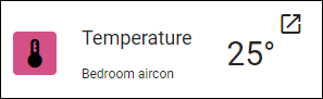
Figure 1 - Widget with On-click configured
4. Endpoint linking
Endpoints can be linked to a widget by selecting the Endpoint linking icon at the top of the Config editor. Users can click the “Link” button on the Value section to open the subscription types.
Clip 3: Endpoint linking
Two options are available:
Endpoint: Link a specific endpoint to the widget; the user can navigate the entity tree and select the endpoint to link.
Digital Twin - Contextual: Link a Digital twin template property to the widget; a list of active templates will be displayed from which the user can select and then navigate to the template property to link.
If an endpoint is linked to the widget the number of connected endpoints will be displayed. By clicking on the endpoint count the user can remove a linked endpoint or link additional endpoints.
 |
| A user can now reduce the minimum allowed size of a widget. The minimum size for all widgets will be 1 column by 1 row. This will give the dashboard designer more freedom and control over the layout of the Dashboards they design. To resize a widget, click on the widget and drag one of the anchor points to the desirable size. |