
Toggle Switch Widget
Feb 1 2023 at 12:00 AM
Description
The Toggle switch allows the user to create a true/false switch that is linked to an endpoint.
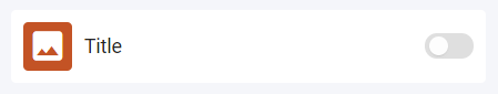
Figure 1 - Toggle Switch widget (landscape)
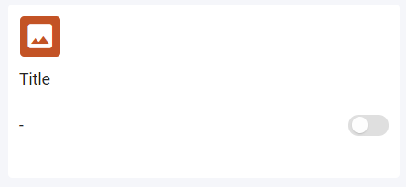
Figure 2 - Toggle Switch widget (portrait)
Properties
Icon
Icon: Choose an icon that best represents its function.
Size: Select icon size; small, medium, large.
Colour: Select the icon colour from the colour pallette.
Toggle
Invert: Select the checkbox to invert the toggle switch values, e.g. on = false, off = true.
Allow toggle interaction: When checked, users can interact with the toggle switch. When unchecked, users will not be able to manually select on/off status.
Use Case
A toggle switch can be used to switch on and off an aircon, see below:
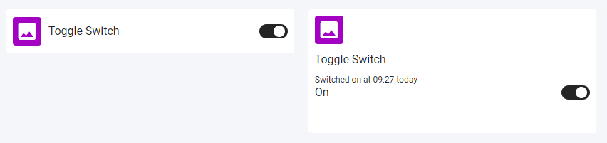
Figure 3 - Toggle Switch on widget
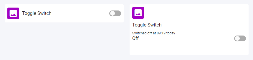
Figure 4 - Toggle Switch off widget