
Charts
Feb 6 2023 at 12:00 AM
Overview
A chart refers to an individual visualisation of selected/configured data in a dashboard. A variety of charts is available for selection, ranging from simple tables to complex time series charts with predictive elements. The chart building process is based on no-code data exploration. An intuitive drag-and-drop environment facilitates unique combinations of metrics and columns designed to create complex, visually compelling charts.
What to expect from this section
This guide will cover the following topics:
- Creating a chart:
- Platform-wide
- From a dataset
- From the Charts tab
- The chart configuration page:
- The Dataset panel
- The Metrics and Columns panels
- Creating/updating charts and saving them.
- Chart Type
- Time
- Query
- Chart Display
- Data
- Further customisations
- Predictive analytics and annotations
Create a chart
Creating a chart can be done from three different places on the platform:
- From anywhere on the Navigator platform.
- From a dataset.
- From the “Charts” tab.
Create a chart: platform-wide
To create a new chart from anywhere on the platform:
Clip 1 - Create a chart from anywhere
- Click on the
+button located in the top right of the window (once in Navigator). This will open a dropdown. - Select the “Chart” option from the dropdown.
- In the window that opens, select the relevant dataset and the type of chart you want to use to represent the data.
- Click on
CREATE NEW CHARTin the bottom right corner of the window to launch the chart configuration page (click here for more detail about the chart configuration page).
Create a chart from a dataset
To create a chart from a dataset:
Clip 2 - Create a chart from a dataset
- Click on the “Data” dropdown found in the top navigation pane.
- Select the “Datasets” option.
- Find the relevant dataset.
- Click on the selected dataset to open the chart configuration page.
- Under “Visualisation Type”, click on “View all charts”.
- Select the required chart type from the configuration page.
Create a chart from the Charts tab
To create a new chart from the Charts tab:
Clip 3 - Create a chart from the Charts tab
- Click on the “Charts” dropdown found in the top navigation pane.
- Once the Charts page has opened, click on the
+CHARTbutton found at the top right corner of the page. - In the window that opens, select the relevant dataset and the type of chart you want to use to represent the data.
- Click on
CREATE NEW CHARTin the bottom right corner of the window to launch the chart configuration page (click here for more detail about the chart configuration page).
The chart configuration page
Once a user has created a new chart or selected an existing one, the chart configuration page will open. This page provides access to all chart types as well as control over their various configurations and customisations.
Each segment on the chart configuration page is tailored to specific aspects of the workflow. Combined, these elements result in a chart that is ready to be added to a dashboard. The main panels labelled in the figure below will be explained in more detail in the following sections.
The following panels/functions will be discussed below:
- Dataset
- Metrics
- Columns
- Create / Update Chart and Save
- Chart type
- Time
- Query
- Chart display
- Data
The Dataset panel
The “Dataset” panel allows the user to change the dataset being used, edit a selected dataset and view a selected dataset in “SQL Lab”.
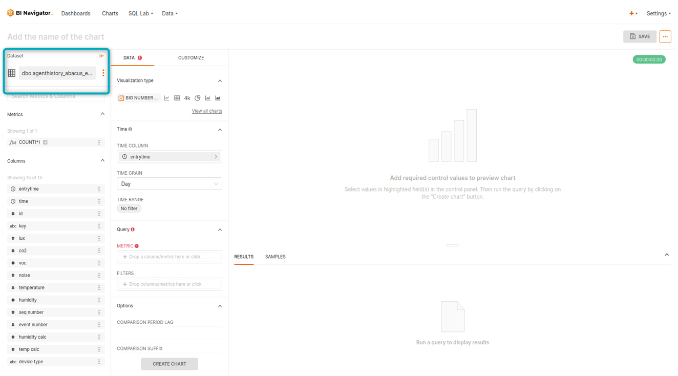
Figure 1 - Dataset panel
Click on the vertical ellipsis icon found in this panel to edit any of these properties:
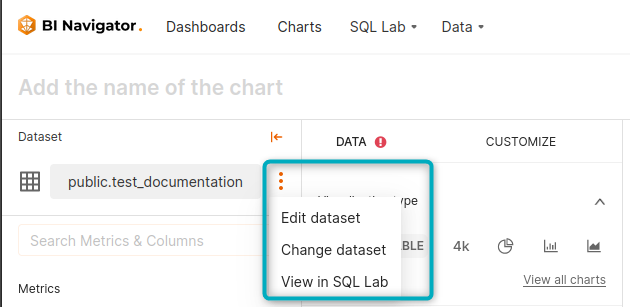
Figure 2 - Dataset dropdown
| Editing these properties will affect charts using that particular dataset. |
Metrics and Columns panels
These panels display all the columns that exist in the selected dataset (2) and provides a convenient overview of the data types associated with each column (1):
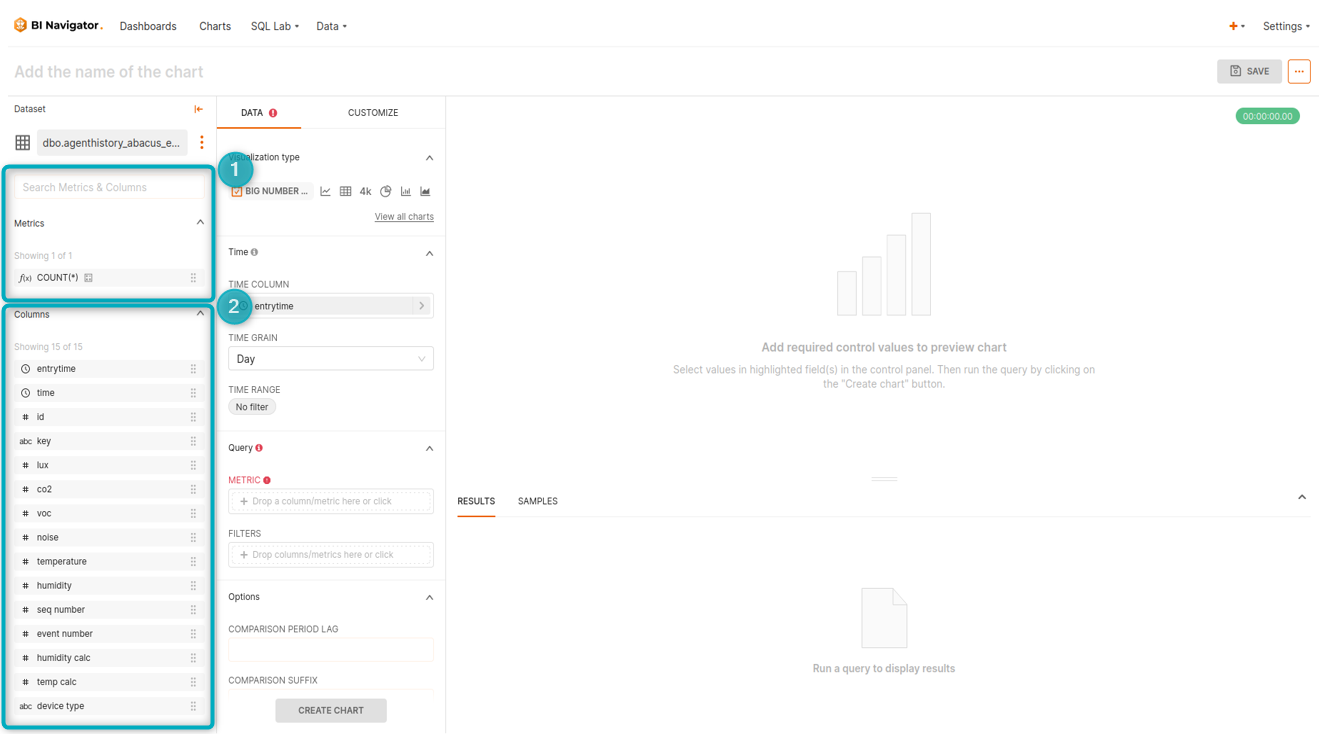
Figure 3 - Metrics and Columns
The data type is represented by the small icon that sits to the left of each column name:
- f - function used for metrics.
- Clock - the datasource’s time column(s).
- ABC - text data.
- # - numeric data.
- 1 / 0 - boolean data.
These metrics and columns are used in the “Query” panel to create data settings that will build the chosen chart type.
Create/Update Chart and Save
Once the chart’s settings have been configured, click on the CREATE CHART button. This will run the query and provide the user with a preview of the chart’s display:
Clip 4 - Create/Update Chart and Save
- Once the chart’s display is correct, click
SAVEto save the chart’s settings. - A dialog box will open. Give the chart a name and select the dashboard to which it needs to be linked.
Clicking on CREATE CHART will allow the user to see a preview of the chart before saving it. However, doing this will not automatically save the chart. Click on SAVE to save the new chart or update an existing chart with new settings. If you click on SAVE without clicking on CREATE CHART/UPDATE CHART, the chart will save without first providing a preview. |
Chart Type
The “Chart Type” panel is used to change the visualisation type. The default visualisation is a table:
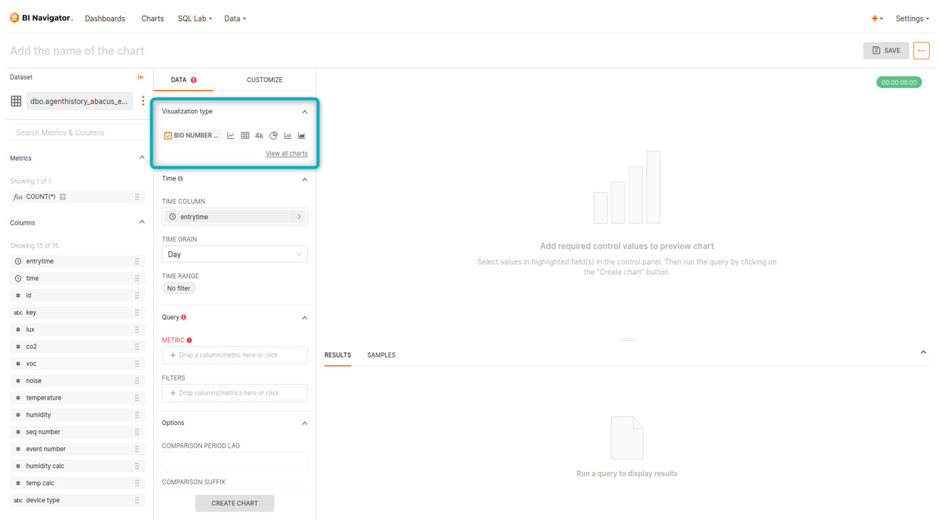
Figure 4 - Chart Type panel
Click on the table button/icon in the panel to launch the visualisation selection window. This will grant access to a variety of chart types from which a user can select a preferred visualisation:
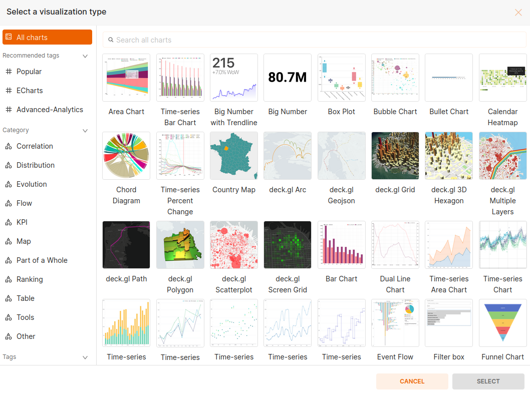
Figure 5 - Chart type selection
Time
The “Time” panel is used to set the dataset’s time-related settings:
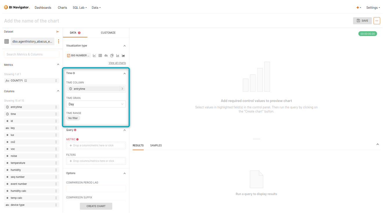
Figure 6 - Time panel
As shown in the clip below, in this panel the user can specify the granularity of the displayed values using the “Time Grain” dropdown, as well as define a time range filter using “Time Range” options. These options allow the user to set the date range within which data should be extracted, as well as the granularity of the data being aggregated.
Clip 5 - Configure time settings for a chart
If Navigator does not automatically fill the “Time Column” field with a datatime column, the user can specify it manually.
Query
This panel allows the user to choose what data to visualise.
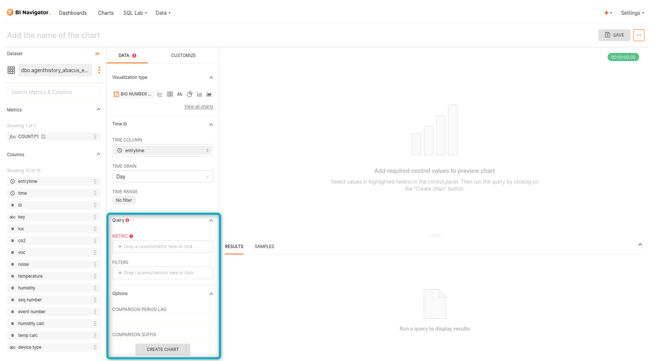
Figure 7- Query panel
As shown in the clip below, the user can choose the data they want to visualise by adding columns as metrics:
Clip 6 - Configure query settings for a chart
The user has significant control over the selected metrics through the following dropdowns:
- Group By
- Metrics*
- Sort By
- Filters
*Metrics can accommodate custom SQL inputs - max_by(col1, time_col)
| Each chart type will have different options available in the “Query” panel of the configuration page. It is worth experimenting with a few charts to find the one with the most suitable features. Red fields in the “Query” panel are required and cannot be left blank. |
Chart Display
Once all the required panels have been configured, the chart will render in this section.
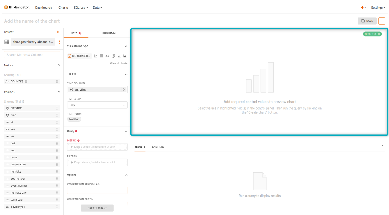
Figure 8 - Chart display panel
| As shown in the clip below, almost all chart types are interactive. The user can hover the cursor over different parts of the chart to see additional information. |
Clip 7 - Interactive chart display
Data
Once a user saves a chart or renders it by clicking on CREATE CHART, this section will display the underlying data being used to create the chart:
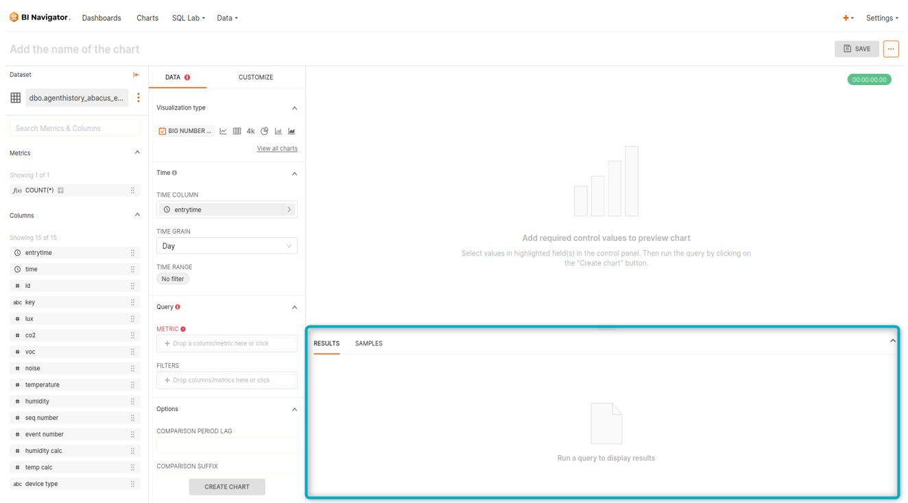
Figure 9 - Data panel
Further Customisations
Most charts offer varying degrees of customisation. Select the “Customize” tab to see available options for the required chart type. The “Customize” tab is located next to the “Data” tab.
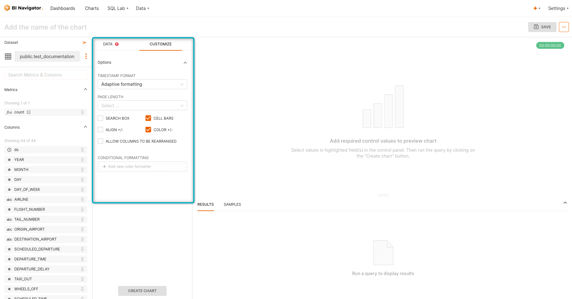
Figure 10 - Customise Tab
| Settings that can be configured in the customisation tab will depend on the chart type and other settings already set by the user. |
To find a data visualisation that best suits an application, experiment with different chart types and configuration settings to see how the data can be expressed in different ways.
Some tips:
- Use different columns in different combinations to see what works best for the story being told.
- Update the time range or add a filter to access more/less data.
Predictive analytics and annotations
Some time series charts will offer “Advanced Analytics”, “Predictive Analytics” and “Annotation” functionality.
The clip below shows an example of a rolling mean functionality under the “Advanced Analytics” tab:
Clip 8 - Example: Advanced Analytics