
Time Series Widget
Feb 1 2023 at 12:00 AM
Time Series Bar Chart
Description
The Time series bar chart widget is a widget that displays various endpoints' values in the form columns allowing a user to easily compare values.
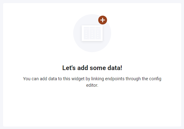
Figure 1 - Time Series Bar Chart widget
Properties
Title: The title of the widget.
Legend: Specifies whether the legend is visible or not.
Download: Specifies if the user can download the charts data. If enabled the user can download the data by selecting the download option from the overflow.
Y-Axis: Title of the Y-Axis.
Y-Axis Label: The tag for your chart.
Y-Axis size: Size of the Y-Axis text.
X-Axis: Title of the X-Axis.
X-Axis Label: The tag for your chart.
X-Axis size: Size of the X-Axis.
Thresholds: A threshold is a static horizontal section on the chart that is not linked to an endpoint value. Multiple thresholds can be added. The following settings can be set per threshold:
- Min : Specifies the lower value of the threshold, based on the Y-axis.
- Max : Specifies the upper value of the threshold, based on the Y-axis.
- Colour : The colour of the specific threshold.
Default dates: This is where you can edit the show last date and intervals. It is predefined intervals that can be setup for the chart that’s selected at runtime. Show last and intervals can be setup as every X seconds, minutes, hours, or days.
Use Case
The Time series bar chart below is an example of a households power being used, the bar chart shows the power and power total.
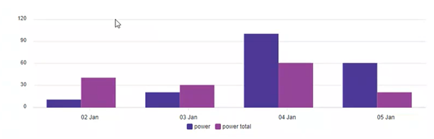
Figure 3 - Time Series Bar Chart widget example
Time Series Line Chart
Description
The Time series line chart widget is a widget that displays historical values for endpoints in a continuous line that connects the various endpoint's values.

Figure 2 - Time Series Line Chart widget
Properties
Type: Specify the chart's line type, sharp, sharp filled, smooth, and smooth filled.
Title: The title of the widget.
Legend: Specifies whether the legend is visible or not.
Download: Specifies if the user can download the charts data. If enabled the user can download the data by selecting the download option from the overflow.
Y-Axis: Title of the Y-Axis.
Y-Axis Label: The tag for your chart.
Y-Axis size: Size of the Y-Axis text.
X-Axis: Title of the X-Axis.
X-Axis Label: The tag for your chart.
X-Axis size: Size of the X-Axis.
Thresholds: A threshold is a static horizontal section on the chart that is not linked to an endpoint value. Multiple thresholds can be added. The following settings can be set per threshold:
- Min : Specifies the lower value of the threshold, based on the Y-axis.
- Max : Specifies the upper value of the threshold, based on the Y-axis.
- Colour : The colour of the specific threshold.
Default dates: This is where you can edit the show last date and intervals. It is predefined intervals that can be setup for the chart that’s selected at runtime. Show last and intervals can be setup as every X seconds, minutes, hours, or days.
Use Case
The Time series line chart below is an example of a homes ambient kitchen temperature for a week in December, the different colour lines indicate different endpoints at various humidity percentages.
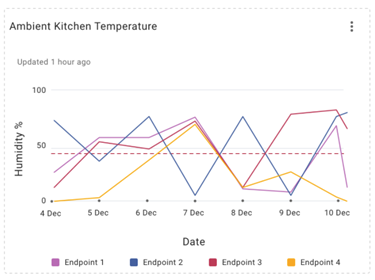
Figure 4 - Time Series Line Chart widget example