
Single-Value Widget
Feb 1 2023 at 12:00 AM
Description
The Single Value widget is a widget that displays a single endpoint value on the Radar view, additionally, the widget supports a title, description, and an icon. The widget supports two predefined layouts by default: portrait and landscape.
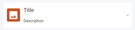
Figure 1 - Single Value widget (landscape)
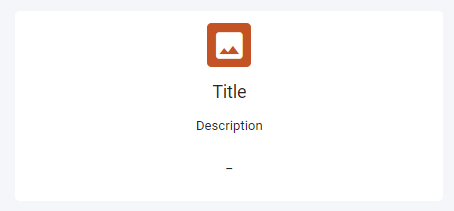
Figure 2 - Single Value widget (portrait)
Properties
Icon: Specify the icon to be used. Any of the Material design icons can be used, list of available icons can be found at: https://material.io/resources/icons
Size: Four size options are available.
Background: Specify the background colour of the icon by selecting a data visual colour. The user's selected theme will determine the background colour.
Description
Value: The description to be displayed on the widget.
Type : The type of the description which determines the default value for the size of the text.
- Heading: Size is set to 16.
- Sub-heading: Size is set to 14.
- Body: Size is set to 12.
- Custom: User can specify the size of the tile.
Size: Specify the size of the title, if the default size is changed then the Type property value will change to Custom.
Format: Can change the format of the title to Superscript or Subscript.
Align: Align the title left, centre or to the right of the widget.
V-Align: Vertical alignment of the tile, options available are top, middle, bottom.
Value
Value: By default, the following text is added to the value section: '\<%=VALUE%\>'. This represents the value of the endpoint linked to the widget, this value can be changed if a static value must be displayed. A unit of measure can be added by adding the unit of measure to the value string. The following text will display add the km unit of measure after the value: '\<%=VALUE%\> km.'
<%=VALUE%>: Current value of endpoint<%=VALUE | TIMESTAMP%>: Date and time of last update<%=VALUE | ELAPSED%>: Time since last update- You can also add any string value directly into the textbox, this will display your text as is.
Type: The type of the description which determines the default value for the size of the text.
- Heading: Size is set to 16.
- Sub-heading: Size is set to 14.
- Body: Size is set to 12.
- Custom: User can specify the size of the tile.
Size: Specify the size of the title, if the default size is changed the Type will change to Custom.
Format: Can change the format of the title to Superscript or Subscript.
Align: Align the title left, centre or to the right of the widget.
V-Align: Vertical alignment of the tile, options available are top, middle, bottom.
Use Case
Below is an example of a bedroom aircon temperature given in a single value as a landscape tile.
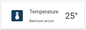
Figure 3 - Single Value widget (landscape) example
The next example is of a laptop battery level in the office as a portrait tile.
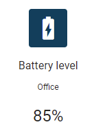
Figure 4 - Single Value widget (portrait) example