
Graph Widgets
Jan 1 2022 at 12:00 AM
Charts
Default and Minimum Size: 5 row x 5 col
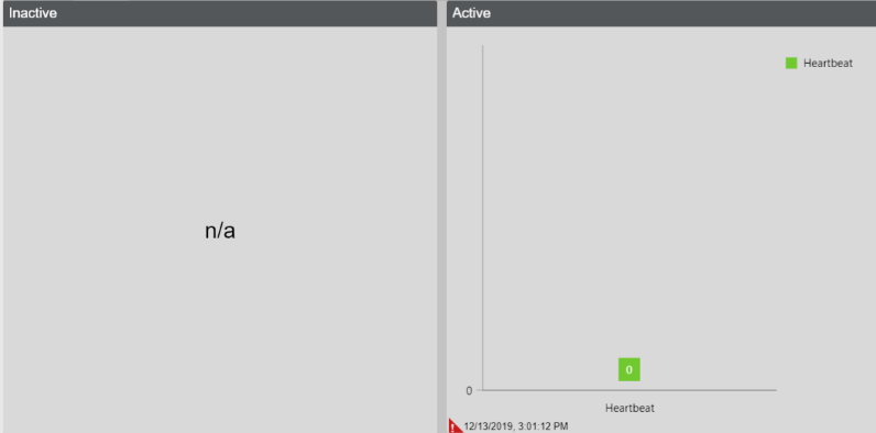
Figure 1 - Chart
A widget to display data in different layouts namely the Bar, Doughnut, Line and Pie charts. If you drop a blueprint or digital twin, it displays the instances on the x-axes and all the endpoints will be displayed as on the y-axes. If the context filter was selected for the dropped Digital Twin or Blueprint it will instead only display one instance on the x-axis which will change depending what is selected in the context filter.
The Chart widget supports endpoints, blueprint properties and digital twin properties. It opts-into the context filter as well as supports all instances.
Power BI
Default and Minimum Size: 5 row x 7 col
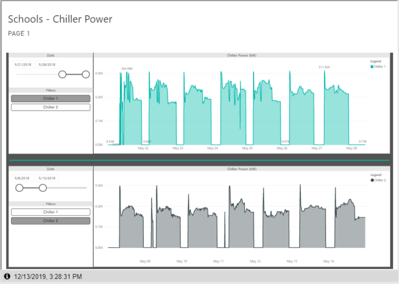
Figure 2 - Power BI
A widget to display power BI Tiles, dashboards and reports. The User will need to first configure the Power BI Ad-hoc service in Portal, once it is configured in design mode the user will be able to select what they would like to view
The Power BI chart doesn't support anything.
Time Series Chart
Default Size: 3 row x 4 col
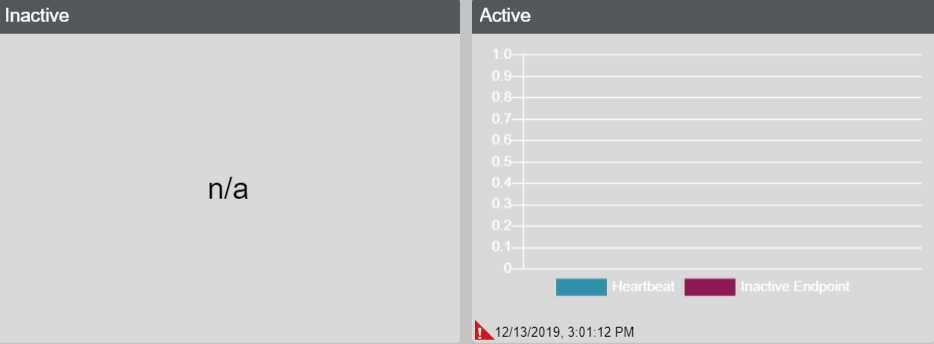
Figure 3 - Time Series chart 1
A widget to display data points at successive intervals of time
Time Series Chart 2
Default and Minimum Size: 4 row x 4 col
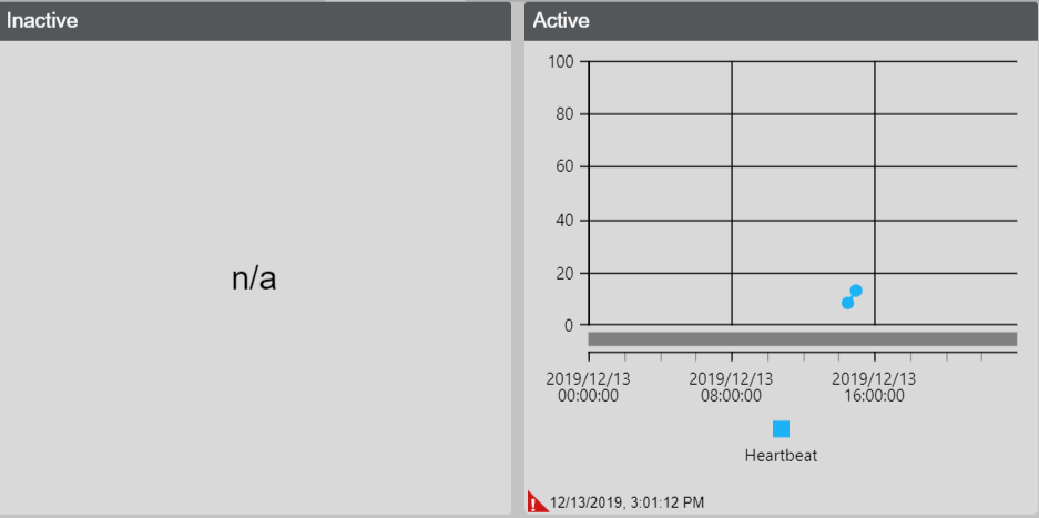
Figure 4 - Time Series chart 2
This is a widget to display data for specified time periods or successive intervals of time. There are two display modes which the user can choose. The Constant Mode is a fixed window of time which allows the user to select the interval type – the period of which to display data within a day, week, or month. Based on this period you select the start and end point within this range, with an interval unit of how often the data is to be displayed every x (interval) - seconds, x - minutes, x - hours and x - days. The Moving Mode is a moving window of time as the interval specified elapses/time passes which allows the user to select the Max points up to a maximum of 100, instead of range. The user can setup two axes one on the left and right, with a min/max value on either side. On the property grid you can select which axes the endpoints are linked to. The Threshold values will allow the user to highlight a specific range within the graph.
If you drop a profile endpoint on the widget, we fetch the data for the chart and display it. The purpose of this is to compare the actual/live values with the profile which represents the predicted values.
A line is created for each endpoint, if all instances is selected for Digital twins/Blueprints then we display all endpoints that belong to that property. Otherwise if context filter is selected then we create one line whose value changes to reflect the selected context.
The Time Series Chart widget supports endpoints, blueprint properties and digital twin properties. It opts-into the context filter as well as supports all instances.