
Dashboard
Nov 4 2022 at 12:00 AM
- Description
- Key Features
- Dashboard Settings
- Navigation
- Dashboard Configuration
- Widget Toolbox
- Conditional Formatting
- Timed Out Status (indicator in footer of all widgets)
Description
Commander™ Dashboard is a visualisation tool that allows users to track the communication between devices and systems. It has a set of widgets that users can choose from to build their dashboards with various functionalities that help formulate their solutions.
Key Features
- Near real-time asset monitoring.
- Visualisation of active and inactive alarms.
- Digital overlay offering a single view for multiple assets.
- Location-based visualization and tracking.
- Time Series Charts with 7 days history for subscribed values.
- Single or batch gateway communication.
Navigate to the dashboard on the Commander™ home page, via the app's menu, or via the recently used or favourites. Once the user clicks on the application, it will take them to the default home view set for the tenant, unless a home view has already been configured by the user. Location within the entity tree can be seen at the top via the bread crumbs listed.
Dashboard Settings
These are the dashboard settings available as highlighted in Figure 1 below.
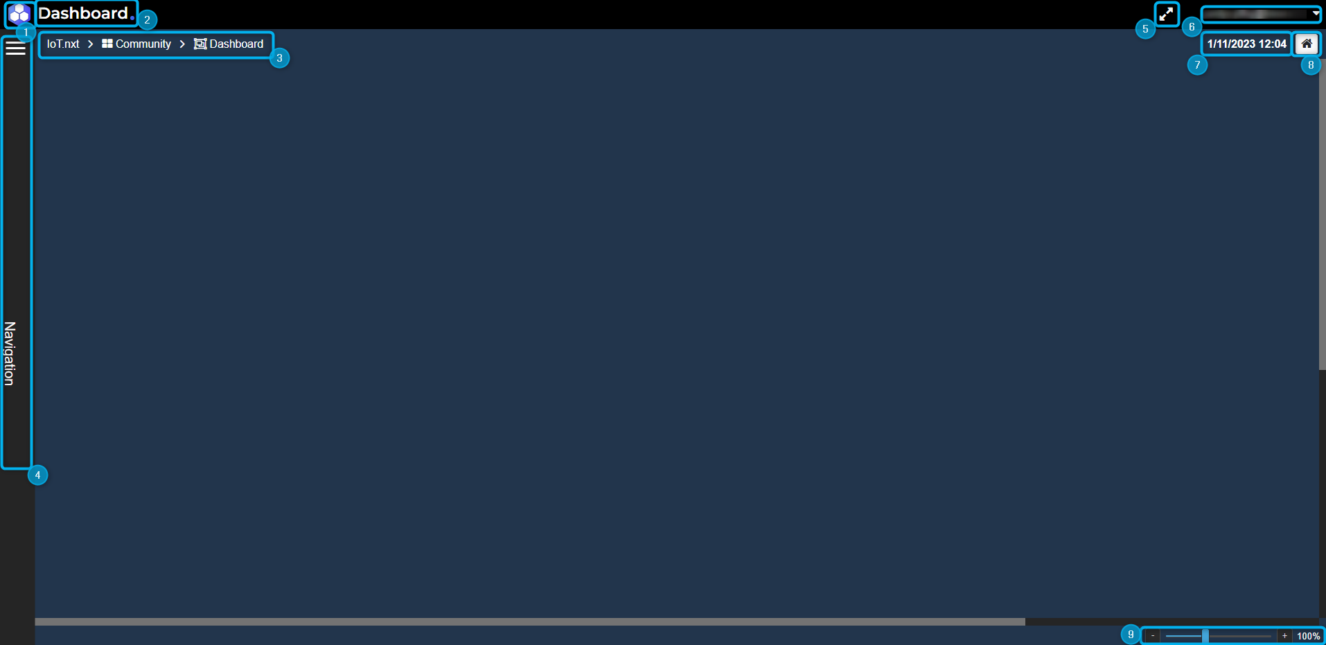
Figure 1 - Dashboard Settings
- Navigation back to the Commander™ homepage.
- Account name.
- Breadcrumbs for the dashboard that users are busy viewing.
- Navigation menu.
- Full-screen mode.
- Dropdown menu with the user settings for the dashboard.
- Current date and time.
- Navigation to the user's home view, if configured. If not personally configured, the user will navigate to the home view set for the account, if configured.
- Changes the dashboard scale settings.
The Commander™ Dashboard user settings are shown in Figure 2 below:
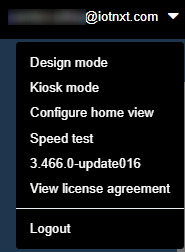
Figure 2 - User Settings
- Design mode - allows the user to go into the design portion of the dashboard where they will have access to the widget toolbox so the user can configure their dashboards to build it.
- Kiosk mode - this will enter the user into the full screen without visualisation of settings so that it gives it a clean and simple look.
- Configure home view – allows the user to configure their home view by setting the current view as their home view. The user can also clear their home view if required. The user can also enable the timeout such that if they are inactive on any view for a specific amount of time, the platform will return them back to the home view.
- Speed test – it shows the user their latency, their download and upload speed for the specific dashboard. Once the test is done, the user has the option to export the results. This is mainly used to keep track of dashboards that are consuming a lot of data so they can be optimized.
- 3.457.1-update001 - it shows users the current version of the Commander™ Dashboard.
- View license agreement - allows the user to view the license agreement.
- Logout – allows the user to log out of Commander™ Dashboard.
Navigation
Navigation will involve opening the navigation menu (Figure 3) on the left, and it will give users access to all of the view entities. Here the user can select anything that they wish to view.
 |
| A user can navigate from within a dashboard if click-throughs are configured on the widgets. |
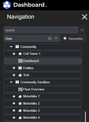
Figure 3 - Navigation Menu
A user can navigate to a new view via one of two ways,
By using the navigation menu where one can search for a specific view. The user can type in the search bar to see the options available while typing, and then select the specific view they would like to load. Selecting the arrow icon at the end of the search result with open that entity within the entity tree. The user can also scroll through the entity tree created for this solution to find the specific view. Click on the dashboard entity to navigate to it. See a demonstration in Clip 1 below:
Clip 1: Dashboard Navigation
The second method of navigation is via click-throughs on a dashboard. Click-throughs can come in different forms,
A click-through on a widget, indicated by the view icon on the widget in the top right corner. If the user hovers over it they can see the breadcrumbs of the view subscribed to the widget.
Geo map click-through properties, the user can click on alarm circles on a Geo map and be navigated to the chosen dashboard.
 |
| Holding CTRL on your keyboard and clicking on a click-through widget will allow the user to open that view in a new tab. |
Clip 2 below, shows navigation via an alarm circle, and then via a single value widget. The alarm circle must be configured with the view properties in order for the click-through to function (see geo location service). It will also demonstrate the navigation via a widget that has been subscribed to a view that is demarcated with the icon.
Clip 2: Dashboard Navigation – Click-Through
|
| Users can also navigate to their dashboard view via breadcrumbs, and this allows them to see the entity tree structure for where the view sits. |
Dashboard Configuration
Once endpoints are configured in Portal, Commander™ allows the user to visualise their data in a Dashboard making use of preconfigured widgets. Depending on the widget type, the user then needs to link a desired endpoint value configured in Portal as an endpoint to the widget, by simply dragging that property onto the widget. The property value will then be displayed on the widget, live values are displayed in various forms, including temperature graphs, current graphs, dynamic imaging of temperature, voltage gauges and a button for controlling a fan. Widgets are components of the Dashboard interface that enable the user to visualize data, perform a function or access a service. Below is a list of widgets available in Commander™ Dashboard, and an illustration of utilizing the widgets and allocating them to a Dashboard (canvas), linking them to endpoints to visualize their data.
Widget Toolbox
| Widget | Description |
|---|---|
| Alarm Grid | A widget that finds and displays all alarms of high, medium and low priorities inside a parent, by default on tenant level and allows the user to drill down further into children – site or group. |
| Alarm List | A widget to display a list of alarm entries (actual alarms) by default on tenant level. |
| Calendar | A widget that allows the user to drop one calendar entity, it will then display all the individual events/series of events for that specific calendar, and allow users to update, delete and add to them. |
| Collection Grid | A specialised widget that displays Tag tracking meta data, refreshes as a packet is received and is not configurable. |
| Context Filter | A widget that changes the information displayed in the tiles on the page and in the graph linked to the blueprint/digital twin. |
| Data Grid | A widget to display blueprint and digital twin properties and their values in a grid format, able to select which parts of the template/blueprint the user wants visible as columns, as well as specify the formatting. |
| Digital Overlay | A widget to display the values as they would be reflected within a real-life object. An image can be dropped as a background, of which a user can create an overlay of elements (images, value boxes or polygons) on their relative layers, the different layers of visualisation will be used for the purpose of separating categories, each layer can be viewed independently – monitoring different sensors that return different values. |
| Dynamic Grid | A widget to display a friendly GUI for constructing requests (GET/POST) and reading responses by interacting with HTTP APIs. |
| Gateway Batch Communication | A widget to control an endpoint on one or more gateways, Portal and Dashboard values linked to the gateway will be updated to reflect the change made on the widget. |
| Gateway Communication | A widget to communicate with a single gateway, Portal and Dashboard values linked to the gateway will be updated to reflect the change made on the widget. |
| Geo Map | Geo Maps display location data linked to the map widget from either Entities, Blueprints, Digital Twins or a Geo-location Service. |
| Historical Alarm Grid | A widget to display the latest active alarms for the tenant with filtering capability. |
| Iframe | A widget to display an iframe, if the user provides a url of a website it can be viewed here (load and display). |
| Last Connection Info | A widget to display the duration since the last connection in days, hours, and minutes. |
| Single Value | A widget to display both the actual value of a device and additionally display the recommended value which can be created as a setpoint. |
| Static Image Widget | A widget to display a static image. Click-through enables normal views, digital twin views and endpoints. |
| Tab Control | A tabbed widget that supports hosting widgets in the tabs, the max limit is 10 tabs. |
| Time Series Scale | A widget that sets the scale for the "Time series chart widgets". |
| URL Navigation | A widget to allocate and navigate to a URL, if clicked on it opens the URL in a new tab. |
| Value List | A widget to display data points and their values in a grid format. |
| Circular Gauges | A widget to display a semi, open, full or custom gauge where they can specify the start and end degrees which will affect the shape of the gauge. |
| Radial Gauges | A widget that displays a gauge. |
| Graphs | A widget to display data in different layouts namely the Bar, Doughnut, Line, Pie, Time Series, and Time Series 2 charts. |
| Video | A widget to view live camera footage. |
Entering design mode of the Dashboard allows the user to configure their very own Dashboard (canvas) and how they plan on utilizing the widgets to visualize their data. To configure the dashboard, activate design mode and access the widget toolbox to start building the user's view. Users can navigate to design mode, open the widget toolbox and begin building by dragging and dropping widgets onto the dashboard. See a demonstration in Clip 3 below:
Clip 3: Widget toolbar
Entering Design mode of the widget allows the user to customize their widget properties and subscribe (link) endpoints, blueprints or digital twin properties to a widget, as well as visualize what is currently subscribed to the widgets. This is demonstrated in Clip 4 below. Once the user is finished designing their view, they should click Done editing in the top right-hand corner.
Clip 4: Dashboard Configuration-Design Mode
Conditional Formatting
The purpose of conditional formatting is to allow the user to customise the widgets such that the widget updates dynamically with live data of the endpoint subscribed. The text, icons and/or colours can be conditionally set for widgets with the conditional formatting feature. In order to set conditional formatting, edit the desired widget by clicking the pencil icon to open the properties pane on the right for that widget. Once open, select the check-box in the top right titled “Advanced Properties” in order to show all available properties, and then click “Open builder” under the Conditional Formatting menu.
The video below shows users how to do that:
Clip 5 - How to navigate to conditional formatting
Once the user has clicked on open builder, they will be able to configure the conditional formatting for this widget. Start off by clicking “Add type” which will provide the IF-THEN configuration block.
 |
| The outputs of the conditional formatting will look different depending on the widget being edited. However, the foundation of the builder remains the same. |
IF Select “Add condition” in order to set up the IF portion of the conditional formatting. There is a drop-down list of a variety of utility functions which can be used. If more than one condition is required for the IF statement, a user can add more by first selecting if it is an “and” or an “or” operation, and then click on “Add condition”, which can then be configured as previously done. THEN There are three different options for outputs of the conditional formatting on the widget.
- Colour - the colour desired for the IF logic provided. This colour will display differently per widget being configured.
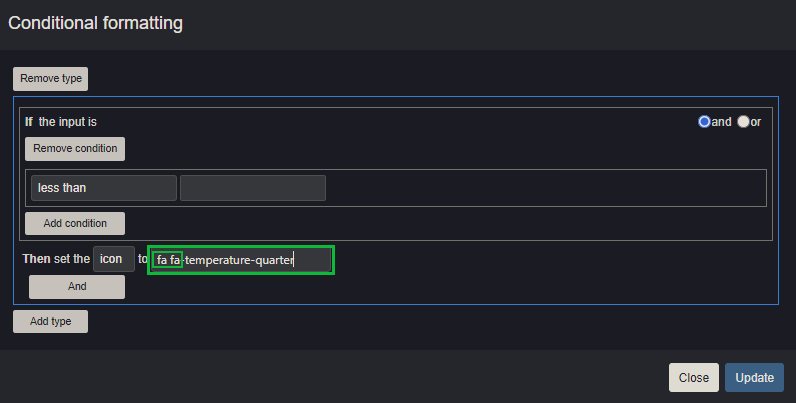
- Icon - the icon desired for the IF logic provided. The icons are pulled from Font Awesome which has been integrated with Commander™. In order to configure a Font Awesome icon, input “fa fa-icon-name”
- Text - the text desired for the IF logic. It is important to note that if this option is selected and configured, the live value of the endpoint subscribed to the widget will not display, but rather the configured text in its place. The video below shows users how to configure conditional formatting:
Clip 6 - Adding a type and condition
Once the configuration of the IF-THEN statement is complete, another statement (or type) can be added with Add type with AND or OR logic, or the user can save and close by clicking “Update”.
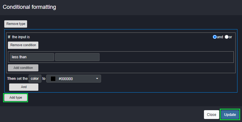
Figure 4 - Save your changes
 |
| When adding an icon, the following site can be used to find the desired icon: Font Awesome, which can then be pulled into Commander™ by copying the name of the icon and pasting it into the input box as follows: fa-fa-icon-name, as seen in the figure below: |
Figure 5 - Setting up an icon
 |
| Selecting the three ellipses at the top right corner of the widget will open the widget options, which will provide the option for copying conditional formatting, which then can be pasted onto another widget using the widget options menu. |
Example of conditional formatting can be seen below:
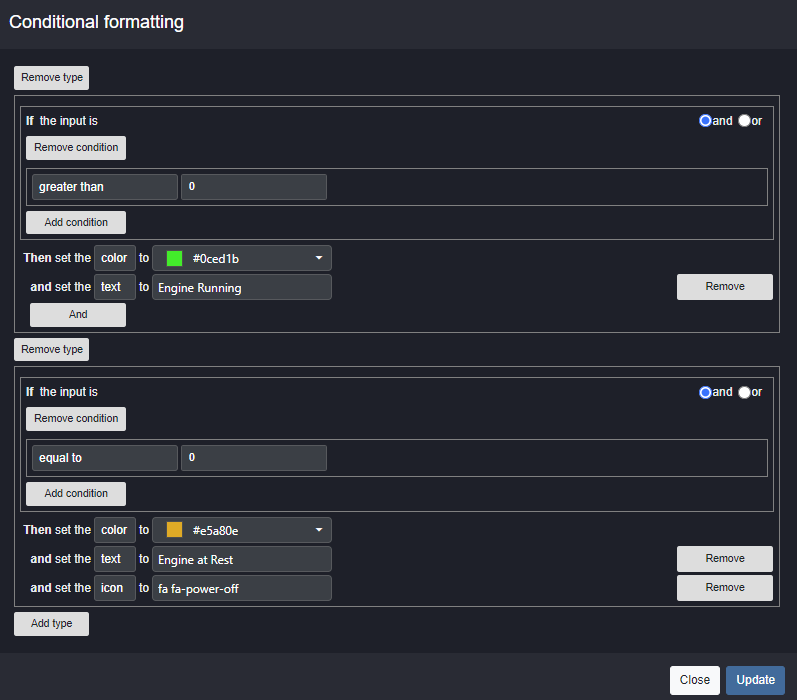
Figure 6 - Example of conditional formatting
In the video below, users will be able to see how the widget updates when the value of the widget updates. This value is being updated manually here for demonstration purposes, but it would generally work by linking a live endpoint to the widget which would then cause the widget to update as configured.
Clip 7 - Example of conditional formatting
Timed Out Status (indicator in footer of all widgets)
It is important for the user to know whether the gateway/device linked to the widget is sending data. Widgets include a footer that can be enabled by selecting from the following options - to hide (hide footer), display date only, OR display date and endpoint history (linked endpoints will display values as they are received.) in a Grid or visually as a chart.
- Widgets currently configured to show the footer will automatically be enabled for historical endpoints.
- Widgets that do not support endpoints, will by default show a footer with no information if the footer was enabled.
Figure 7 - Footer of widget
Info status
None of the endpoints have timed out,
- Displays Date and Time.
- A tooltip with count all the endpoints that are linked, if selected it will display the Historic endpoints values modal of all linked endpoints.
- A tooltip with no endpoints linked, if selected will not allow the user to open the Historic endpoints values modal.
Timed out status
One or more of the endpoints have timed out,
- Displays Date and Time.
- A tooltip with a count of the endpoints that have timed out, if selected it will display the historic endpoints values modal of all timed-out endpoints.
Historic endpoint values modal
The historic modal will show endpoint values and timed out values, unless the user specifically only opts to view timed-out values.
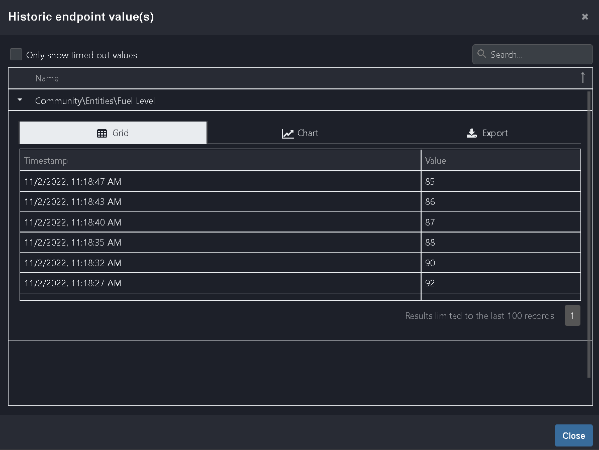
Figure 8 - Historic values modal with Data grid
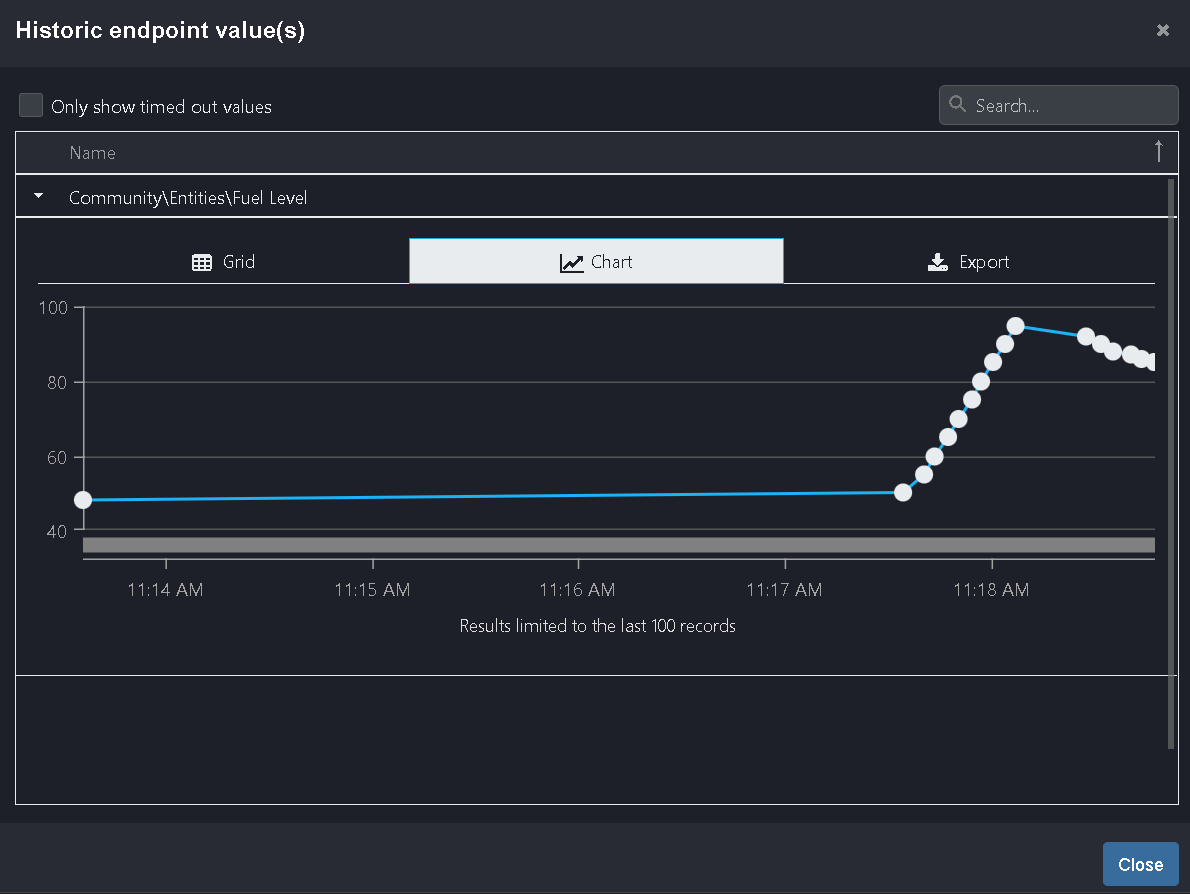
Figure 9 - Historic values modal with Chart
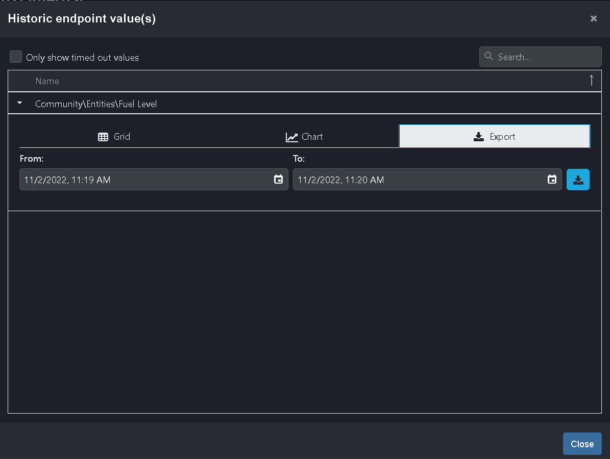
Figure 10 - Historic values modal with Import