
Gauge Widgets
Jan 1 2022 at 12:00 AM
Circular Gauge
Default Size: 2 row x 2 col
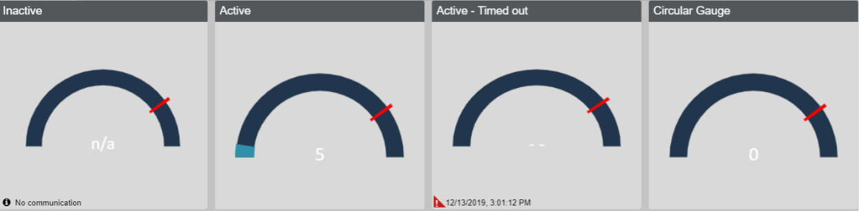
Figure 1 - Circular Gauge
A widget to display a semi, open, full or custom where they can specify the start and end degrees which will affect the shape of the gauge. The Max and min values determine the fill amount of the gauge. The Threshold marker allows you to set a value to alert the user if it has exceeded a value.
The Circular Gauge widget supports endpoints, blueprint properties and digital twin properties. It does opt-into context filter.
Radial Gauge
Default Size: 2 row x 2 col
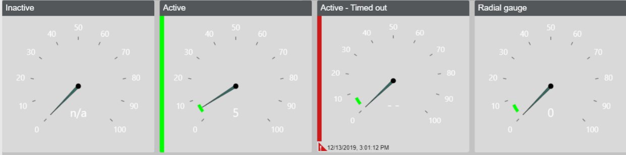
Figure 2 - Radial Gauge
A widget that displays a gauge. The Max and min values determines how much the dial moves by and additionally conditional formatting which will change the left border colour as well as the gauge in a curve colour if specified.
The Radial Gauge widget supports endpoints, blueprint properties and digital twin properties. It does opt-into context filter.