
Digital Overlay Widget
Jan 1 2022 at 12:00 AM
Default Size 4 row x 5 col, Min Size: 2 row x 2 col, No Max Size
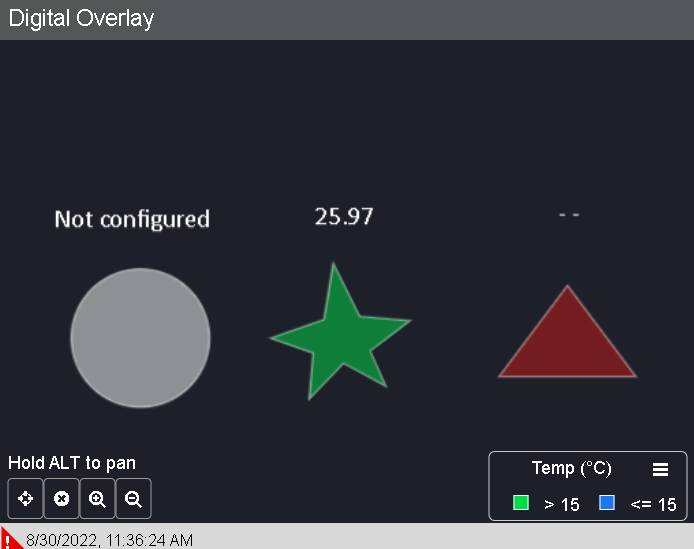
Figure 1 - Digital Overlay
A widget to display the values as they would be reflected within a real-life object. An image can be dropped as a background, of which a user can create an overlay of elements (images, value boxes or polygons) on their relative layers, the different layers of visualisation will be used for the purpose of separating categories, each layer can be viewed independently – monitoring different sensors that return different values. Additionally, if a value has not been received within a specified timeframe, or if that device is sending NULL values, the element will reflect a “Timed Out” state configured for the Digital Overlay (in the case of the example in Figure 9, the polygon element will show red, and the value will display a – for a non-live or real value).
The user can opt-in for search functionality to be able to locate specific properties in a complex layer configuration. A digital twin template will need to be associated to the layer. The digital twin template properties should be linked to the elements which will then be searchable.
For example, a property and value combination to search for desks that have status of available (Desk booking = available/unavailable) will search for and return all elements that are linked to the property and match the search criteria, the user is able to cycle through the search results and find the desired result.
Layer Types:
The Heat map, Location Tracking and Polygon layer have different configurations and functionality.
Polygon layer:
The layer allows the user to view the value for the data or as a colour that represents the value.
Element types available on the layer:
Use an Image box (acts as a placeholder todrop an image), a Value box (acts as a placeholder to allocate an endpoint, to display values) or a polygon (set shapes available, or draw your own shape).
Polygon:
The shape and polygon elements allow you to drop views and endpoints for click-through, as well as endpoints that can be used as values. Min and max values can be configured for gradient and conditional formatting to be used with the shape and polygon elements. The value box only supports endpoints for values, they do not support click-through. Image boxes allow you to drop images and do not support endpoints.
People Tracking:
This layer cannot be created or removed by users as it is automatically created when a location tracking endpoint is linked.
Location Tracking Endpoint:
The endpoint sends the x,y co-ordinates of a collection of real life objects which are then placed on the layer in real-time overlaid on the background image. The user can configure the size and the icon used to represent the object in the layer properties.
Heatmap Layer:
The layer groups a number of heatmap elements. The user can create heatmap elements and link endpoints to them. The heatmap elements display the value from the endpoint as a gradient which is determined using the min and max values. For example, if an endpoint sends a value 23, assuming the max set is set to 100 and the min to 0 and the gradient is configured as per the image below. Then the centre of the heatmap points colour will be light blue.
The gradient that is used on the heatmap elements can be configured by the user. It is setup using 5 colours, each allocated to a percentage.
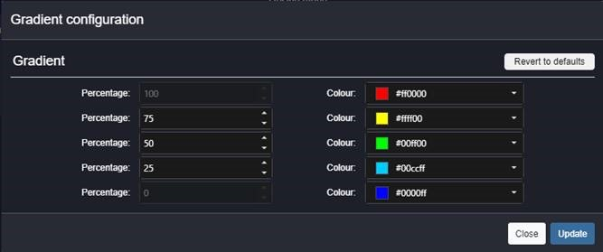
Figure 2 - Gradient Configuration